
Curtain Space Expansion Calculator
Configure Your Setup
Ready to Expand?
Enter your room details on the left to see how much visual space you can gain with the right curtain strategy.
Analysis Result
Recommended Adjustments:
Ever walked into a room and felt like you were shrinking? It’s not just your imagination. The right window treatments can make a cramped living area feel airy and expansive, while the wrong choice can turn a spacious bedroom into a closet. If you are trying to decide what color curtains make a room look bigger, the answer isn’t just about picking white. It involves understanding how light, contrast, and visual weight trick the human eye.
I’ve spent years testing these theories in my own Bristol home, where Victorian architecture often means smaller rooms with low ceilings. I learned the hard way that a heavy, dark velvet drape can anchor a room so firmly it feels like the walls are closing in. But swap that for a sheer, light-toned linen, and suddenly, the space breathes. Here is exactly how to use color to expand your square footage without knocking down a single wall.
The Power of Light Reflection
This is the core principle behind making a room look larger. By reflecting more light, you reduce the visual "weight" of the window treatment. Think of it like wearing black versus white on a hot day; one absorbs heat (and attention), the other reflects it. In interior design, we want the windows to disappear into the background, allowing the eye to travel further across the room.
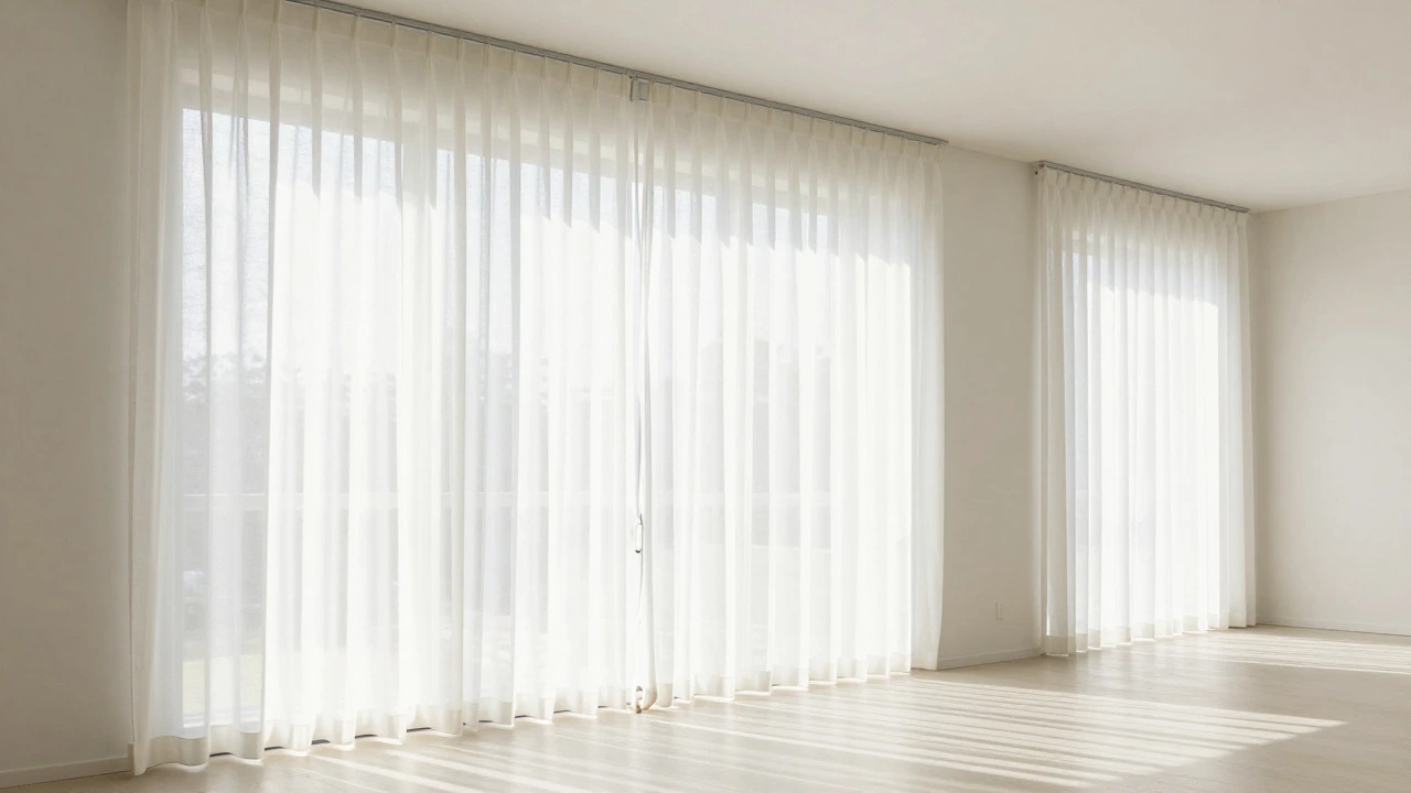
- Pure White: Reflects the maximum amount of light. Best for rooms with north-facing windows that lack direct sun.
- Cream or Off-White: Slightly warmer than pure white. Prevents the room from feeling sterile or hospital-like.
- Pale Grey: A modern alternative that adds slight definition without adding visual mass.
If your walls are stark white, matching your curtains to them creates a seamless blend. This technique, often called "painting by numbers," makes the window frame vanish. Your eye doesn’t stop at the curtain; it slides past it, perceiving the room as larger than it actually is.
The Monochromatic Illusion
You don’t have to stick to white to achieve this effect. The key is minimizing contrast between the curtains and the surrounding surfaces. High contrast creates visual stops. If you have navy blue walls and hang bright yellow curtains, your eye jumps back and forth, segmenting the space. Low contrast allows the eye to glide smoothly.
Let’s say you have sage green walls. Instead of picking a contrasting color, choose curtains in a lighter shade of sage, or a muted mint. This subtle variation maintains interest but avoids creating a hard line that breaks up the wall plane. The result is a cohesive backdrop that feels continuous and therefore larger.
| Contrast Level | Example Combination | Visual Effect |
|---|---|---|
| Low | Beige walls + Cream curtains | Expands space, blends boundaries |
| Medium | Grey walls + Charcoal curtains | Defines zone, neutral impact |
| High | White walls + Black curtains | Shrinks space, creates focal point |
This approach works particularly well in open-plan living areas where you want to distinguish spaces without building physical barriers. A low-contrast curtain acts as a soft divider that doesn’t interrupt the flow of sightlines.
Fabric Texture and Sheer Weight
Color is only half the equation. The material itself plays a huge role in how much "space" the curtains occupy visually. Thick, opaque fabrics like velvet or heavy cotton block light and add bulk. Even if they are light-colored, a thick pile fabric has texture that catches shadows, adding depth and weight.
For maximum expansion, opt for sheer or lightweight linen. These materials allow light to pass through, keeping the connection to the outdoors visible. When you can see the sky or the garden beyond the window, your brain extends the room’s boundary to include that view. It’s an optical illusion that literally adds square footage to your perception.
If you need privacy, layer a sheer under a light-colored roman blind. Roman blinds fold up neatly, taking up minimal visual space when raised, whereas hanging drapes always consume some wall area even when open. Combining a light sheer with a pale roller blind gives you control over light and privacy without sacrificing the airy feel.
Hanging Height and Width Tricks
Even the best color won’t save you if the installation is wrong. How you hang your curtains matters as much as what you buy. To make a room look taller, mount the curtain rod close to the ceiling, not just above the window frame. This draws the eye upward, emphasizing verticality.
- Go Wide: Extend the rod 4-6 inches beyond the window frame on each side. When the curtains are open, they should rest against the wall, not the glass. This exposes the full window opening, letting in more light.
- Go High: Install the bracket 3-6 inches below the ceiling line. This elongates the wall.
- Fullness Matters: Ensure the curtain panels are wide enough to stack neatly to the side. Bulky stacks block light and look cluttered, which shrinks the room.
In my own dining room, moving the rod from 12 inches above the window to just 2 inches below the ceiling added nearly two feet of perceived height. It was a simple fix that cost less than £20 in brackets but transformed the scale of the room.
When Dark Colors Work
Is it ever okay to use dark curtains in a small room? Yes, but with strategy. Dark colors recede in large, well-lit spaces, creating a cozy cocoon effect. In a small room, they usually shrink the space. However, if you use a dark color sparingly-such as a thin trim or a narrow valance-it can add definition without overwhelming the room.
Another exception is when the window faces a busy street or a neighboring house. You might need blackout curtains for sleep quality. In this case, choose the lightest possible shade of your desired dark tone. A charcoal grey will still absorb light, but it won’t be as harsh as jet black. Pair it with a light sheer underneath so that during the day, you can keep the sheers closed for privacy while maintaining brightness.
Common Mistakes to Avoid
Many people try to compensate for a small room by adding pattern. Large floral prints or bold stripes can overwhelm a compact space. If you love pattern, keep it small-scale and low-contrast. A tiny geometric print in beige on cream is far better than a large navy stripe on white.
Also, avoid short curtains. Curtains that pool on the floor or stop mid-calf cut the vertical line of the wall. Floor-length curtains that just kiss the floor or have a slight break create a continuous vertical line, enhancing height. Never let curtains drag; it looks messy and disrupts the clean lines needed for spatial expansion.
Finally, consider the hardware. Ornate, heavy gold rods can look out of place with light, airy curtains. Simple, slim rods in brushed nickel or matte black provide a clean finish that doesn’t distract from the goal of making the room feel open.
Summary of Best Practices
To make your room look bigger, focus on light reflection and visual continuity. Choose light colors like white, cream, or pale pastels. Match the curtain color to your walls for a monochromatic effect. Use sheer or lightweight fabrics to maintain views and light flow. Hang curtains high and wide to maximize window exposure. Avoid high contrast, heavy textures, and large patterns. These small adjustments leverage psychology and optics to transform your space without renovation costs.
Do white curtains really make a room look bigger?
Yes. White curtains reflect the most light, reducing shadows and visual weight. They blend seamlessly with most wall colors, creating a continuous surface that tricks the eye into perceiving more space.
Can I use dark curtains in a small room?
Generally, no. Dark colors absorb light and add visual mass, which shrinks the perceived size of a room. If you must use dark curtains for privacy or style, pair them with light sheers and ensure the room has ample artificial lighting to counteract the absorption.
What is the best curtain fabric for small rooms?
Sheer linen or lightweight cotton are ideal. These fabrics allow light to pass through, maintaining the connection to the outdoors. Heavy velvets or brocades add bulk and block light, making the room feel smaller and darker.
How high should I hang curtains to make the ceiling look higher?
Mount the curtain rod as close to the ceiling as possible, ideally within 2-3 inches. This draws the eye upward and elongates the wall, creating the illusion of greater height.
Should curtain color match the wall color?
Matching or closely coordinating with the wall color is the best strategy for expanding space. Low contrast prevents the eye from stopping at the window, allowing it to travel further across the room and perceive more area.