Bathroom Color Trend Visualizer
Select Your Bathroom Features
Visual Effect Preview
Your selected combination will create a:
Select your options to see results
Recommended Pairings
Lighting Tips
Forget all those sterile white bathrooms you’ve seen in magazines. The color trend for bathrooms in 2025 isn’t about hiding imperfections-it’s about making a statement. People aren’t just painting their bathrooms anymore; they’re turning them into calm retreats, bold personal spaces, or even tiny spas that reflect how they want to feel every morning.
Deep Greens Are Taking Over
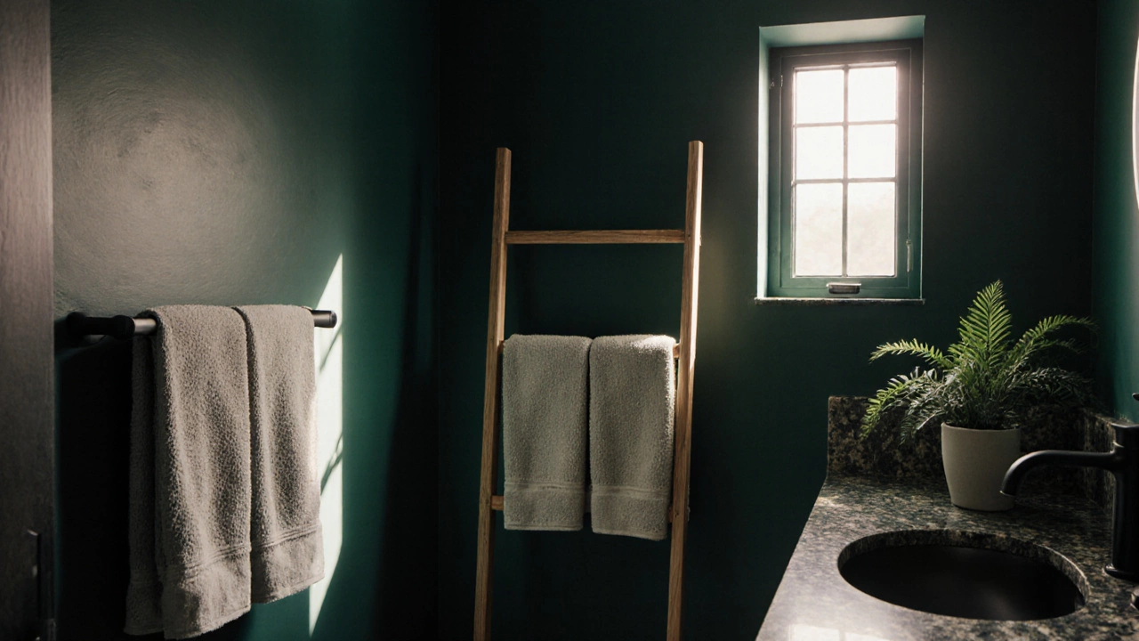
For the past few years, warm neutrals ruled. But in 2025, deep green is the undisputed favorite. Not the neon lime or forest shade from the 90s-this is richer, moodier, and more sophisticated. Think hunter green, emerald, or olive sage on walls, tiles, or even cabinetry. It’s not just a color; it’s a mood. Studies from the British Colour Council show that 68% of homeowners who switched to deep green in their bathrooms reported feeling more relaxed after just one week. That’s because green mimics nature, lowers heart rate, and feels grounding. Pair it with matte black fixtures, natural stone countertops, and linen towels, and you’ve got a spa that feels expensive without the price tag.
Soft Neutrals Are Still Around-But They’ve Changed
White isn’t gone. It’s just evolved. The new neutral isn’t bright, clinical white. It’s off-white with a hint of warmth-like greige, clay, or warm oat. These tones don’t scream "clean"; they whisper "calm." They work especially well in smaller bathrooms where you don’t want to feel boxed in. When paired with brass or brushed gold hardware, they feel luxurious. In Bristol homes, we’re seeing a lot of these shades used on walls with matching ceiling tones to create a seamless, cocoon-like feel. It’s the opposite of cold minimalism-it’s cozy minimalism.
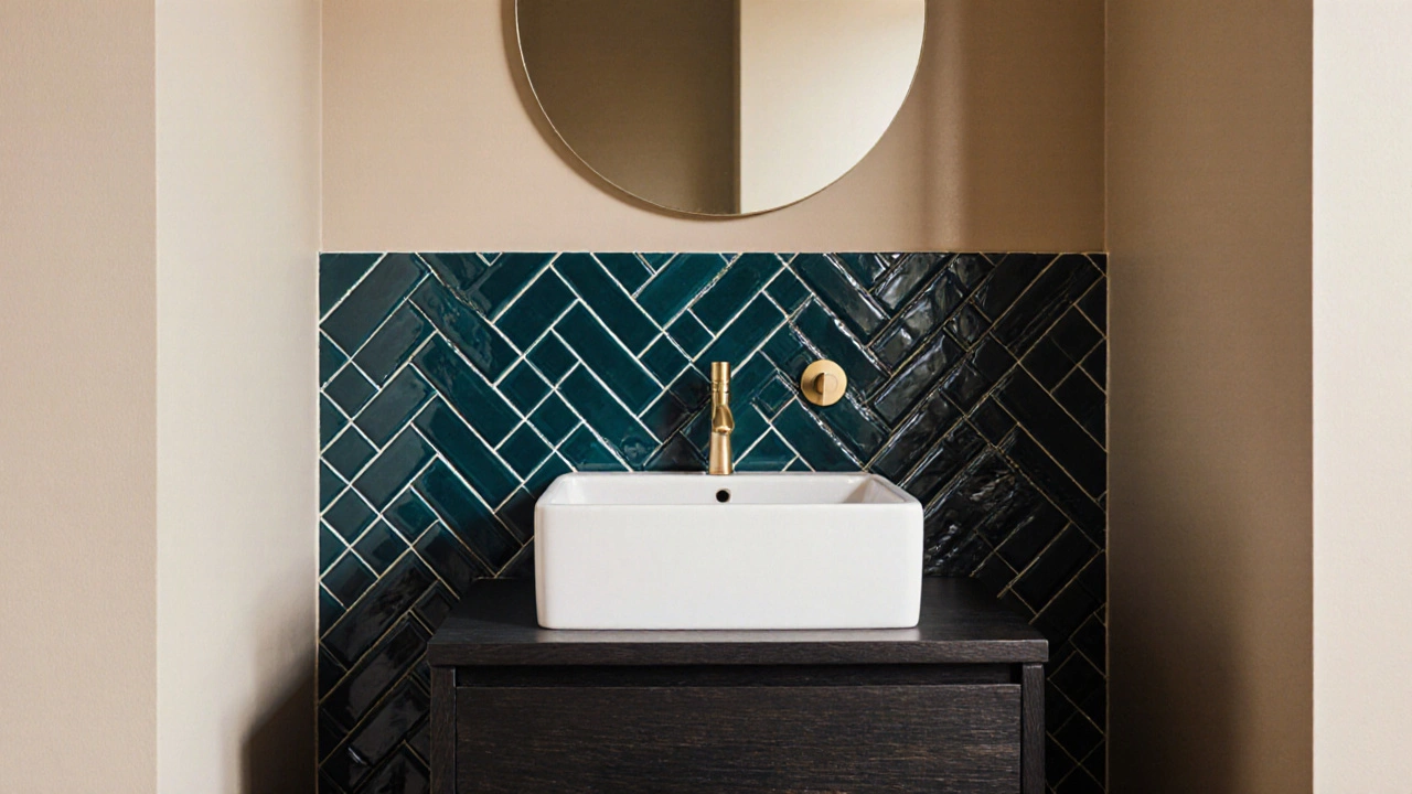
Accent Walls Are Back, But Smarter
One-color-all-over is out. The trend now is intentional contrast. An accent wall behind the vanity or around the bathtub is the new way to add drama without going full-on bold. You might see a deep teal tile in a herringbone pattern behind the sink, or a charcoal plaster wall next to a white tub. The trick? Keep everything else simple. No patterned shower curtains, no colorful rugs. Let the wall do the talking. One homeowner in Clifton told me she spent £300 on a single wall of handmade Moroccan tiles and now says it’s the first thing guests notice-and the reason she looks forward to her morning shower.
Blue Is Still Popular, But Not the Way You Think
Yes, blue is still a top choice-but not the sky blue or aqua from 2020. Today’s bathroom blues are deeper and more complex. Navajo blue, slate grey-blue, and indigo are the new go-tos. These shades feel cool and calming, but they also have depth. They look different in morning light versus evening, which gives the space a living, breathing quality. Blue works best with white or light wood finishes. Avoid pairing it with silver fixtures-it feels too cold. Go for warm brass instead. It softens the whole look.
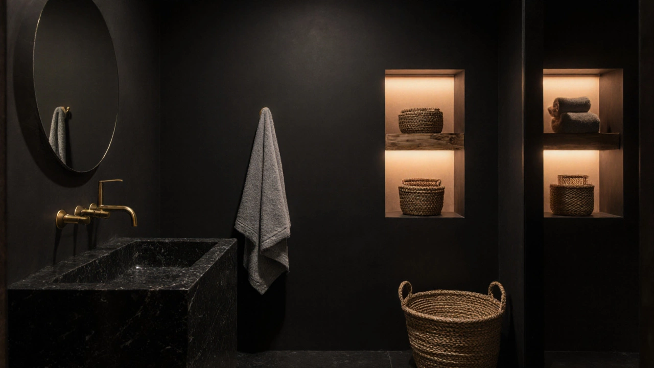
Black Is No Longer an Accent-It’s the Base
Black fixtures, black tiles, even black grout are no longer reserved for industrial lofts. In 2025, black is being used as the foundation. Imagine a bathroom where the walls are matte black, the vanity is black oak, and the sink is a single slab of black stone. It sounds intense, but when done right, it’s incredibly serene. The key is texture. Use matte finishes, rough-hewn stone, or woven baskets to break up the darkness. Lighting becomes critical here-layered lighting with dimmable LEDs makes the space feel warm, not oppressive. In fact, 42% of new bathroom renovations in the UK this year included at least one black element as a core design choice, according to the UK Bathroom Design Association.
What Colors to Avoid Right Now
Not every color is trending. Avoid pastel pinks and baby blues-they feel dated and overly feminine in a way that doesn’t align with modern design. Bright yellows and oranges are also fading fast. They’re high-energy colors, and bathrooms are meant to be restorative, not stimulating. Even white subway tiles are getting less popular. They’ve been overused. If you’re going with white, go for something more textured, like handmade ceramic or ribbed tiles.
How to Test Colors Before You Commit
Painting a whole bathroom is expensive and messy. Don’t just buy a sample pot and slap it on one wall. Here’s what actually works:
- Buy two small sample pots of your top two choices.
- Paint a 2ft x 2ft square on each of two different walls-one facing north, one facing south.
- Live with it for three days. Look at it in the morning, afternoon, and evening.
- Hold up your towel, soap, and shower curtain next to it. Does it clash? Does it feel right?
Colors change with light. A green that looks perfect in daylight might turn muddy at night. This simple test saves hundreds-and a lot of regret.
It’s Not Just About Walls
The color trend isn’t just paint. It’s in the tiles, the vanity, the towels, even the soap dispensers. Many people are now choosing matching color schemes across all surfaces. A sage green vanity with sage green tiles and matching linen towels creates a unified, intentional look. It’s more expensive, yes-but it also feels more like a custom spa than a generic bathroom. If you’re on a budget, start small. Swap out your shower curtain, towel set, and bath mat to match your new wall color. It’s the easiest way to refresh the whole space without a full renovation.
Why This Matters Beyond Aesthetics
Color isn’t just about looks. It affects your mood, your sleep, even your stress levels. A bathroom painted in a calming tone can turn a rushed morning into a quiet ritual. A dark, moody space can feel like a sanctuary after a long day. The trend toward deeper, more personal colors reflects a bigger shift: people are spending more time at home, and they want their spaces to serve their emotional needs, not just their practical ones. Your bathroom isn’t just a room-it’s a reset button.
What’s the most popular bathroom color in 2025?
The most popular bathroom color in 2025 is deep green-specifically hunter green, emerald, and olive sage. It’s chosen for its calming, nature-inspired feel and pairs well with matte black fixtures and natural stone. It’s replacing the all-white trend that dominated for the past decade.
Is white still a good color for bathrooms?
Yes, but not the bright, cold white of the past. The new white is warmer-think greige, warm oat, or clay. These tones feel softer and more inviting. They’re often used on walls and ceilings together to create a seamless, cocooning effect, especially in smaller spaces.
Should I paint my whole bathroom one color?
No. The trend now is intentional contrast. Use one bold color on an accent wall-behind the vanity or around the tub-and keep the rest of the room in a neutral tone. This adds depth without overwhelming the space. Full-color walls can feel too heavy unless you have high ceilings and plenty of natural light.
What’s wrong with pastel colors in bathrooms?
Pastels like baby pink or light blue feel outdated and overly decorative. They were popular in the 2010s but now read as childish or dated. Modern bathrooms favor deeper, more sophisticated tones that feel calming and intentional, not whimsical.
Can I use black in a small bathroom?
Yes, but you need to balance it. Use matte black on one wall or fixture, not the whole room. Add warm lighting, natural textures like wood or stone, and keep the rest of the space light. Black can make a small bathroom feel intimate, not cramped-if done with texture and light.
How do I choose a color that won’t go out of style?
Pick a color that makes you feel calm and at ease-not one you saw on Instagram. Test it in your space under different lighting. Stick to colors with depth and warmth, like deep green, warm neutral, or slate blue. These have stood the test of time in interior design and will likely remain appealing for years.