Ever stepped into a home where the living room felt twice as big, just because the windows had the right curtains? It’s a real thing. The way you dress your windows can make or break how open your space feels. Lots of people think it’s about tearing down walls or ditching all the furniture, but honestly, the magic might just be in the curtain color. The perfect shade doesn’t just finish a room—it can make it feel like you’ve gained a few feet on all sides. Ready to figure out which colors work best, and why?
Why Curtain Color Impacts the Perception of Space
Color does weird things to our brains. Imagine standing in a room painted black, with thick velvet drapes in deep navy. Feels snug, maybe even a little claustrophobic, right? Flip that to white walls, soft ivory curtains, and suddenly you’re breathing easier. This isn’t just about taste—it’s physics and psychology in action. Light colors reflect more light, while dark ones absorb it. When curtains match or closely echo the color of your walls, our eyes don’t stop at the window—they just keep scanning. The lines are blurred, and so is the boundary of the room.
But it’s not all about being matchy-matchy. Pale curtains—think whites, off-whites, pale greys, soft taupes—are like a room’s personal light reflectors. Every time sunlight hits them, it bounces around the space, giving you extra brightness and a feeling of openness. Scientific journals covering color theory have shown our brains interpret extra light as extra room. That’s why hospitals and hotels love simple, light drapes.
There’s also something called "visual weight." Dark or bold curtains act like a wall, especially if they contrast sharply with lighter walls. Your eyes hit that edge and stop. Light curtains make the window almost disappear into the wall. This trick fools the brain into stretching the dimensions, the same way wearing nude-colored heels can make your legs look endless. It’s all in the mind, but it works.
Interestingly, designers don’t always reach for blinding white. Pale linen, sandy beige, gentle dove grey, or even an icy pastel blue can work wonders—and feel less sterile than plain white. Plus, those shades are easier to keep looking fresh. If you have natural light, these curtains amplify it. If you’re working with less sunshine, a bright curtain can catch even weak daylight and throw it back into the space.
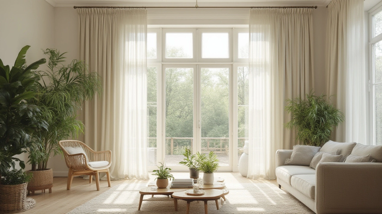
Let’s not forget about the textiles. Sheer curtains in light colors are double trouble—in a good way. They let sunlight through while filtering glare, meaning you’ll get that soft, glowy effect magazines love to showcase. Layering a transparent curtain with a solid pale one behind gives you options, bouncing light when you want it and privacy when you need it. Most stylists recommend pooling the sheers all the way down to the floor for an uninterrupted vertical line, which draws the eye up and maximizes height.
Now that you know why curtain color matters, it’s time to get more specific. What shades and techniques actually deliver that "bigger room" trick? Let’s get into the nitty-gritty tips, the ones designers actually use at home.
The Best Curtain Colors for Making Small Rooms Feel Spacious
Forget the myth that only stark white will do. There are plenty of shades that give you more room to breathe—without looking cold or clinical. The trick is to pick colors that are light, reflective, and close in tone to your wall color. This prevents visual breaks and keeps the room’s flow intact.
What works in most spaces? Start with soft neutrals. Cream, oatmeal, greige (that lovely grey-beige mix), pastel blush, or light sage show up often in small apartments or studios for a reason. They’re bright but not harsh, warm but not overpowering. Even designers in notoriously tiny cities like Tokyo or Paris swear by these hues because they play nicely with both natural and artificial light.
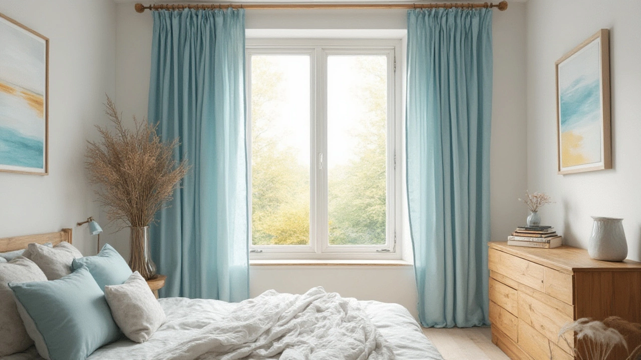
There’s a growing trend for pale blue or even the softest mint, especially in bathrooms and bedrooms. Those shades have a calming effect and feel fresh, drawing in light and sending it bouncing from wall to wall. Some interior magazines have highlighted pale lilac or light peach for the same reason: both offer subtle color without adding weight. You don’t need a candy shop, but don’t be afraid of a slight tint—especially if your space lacks personality.
Matching the curtain color to your walls is one of those old-school designer tricks that really works. If the shades are similar, it’s like you’re extending your walls outwards. Try it: hold a fabric sample up to the wall and squint. If your eye blends the two together, you’re on the money. If there’s a hard line, look for a softer, lighter version.
Here are some curtain color ideas for different wall colors and effects:
- White, cream, or light grey walls: Pair with curtains in icy greys, pure white, soft chamomile, or butter yellow.
- Pale beige or taupe walls: Cream, linen, pale blush, or soft caramel curtains will add warmth and bounce light.
- Soft blue or green walls: Try pale aqua, mint, or silvery sage curtains.
- Pale pink or blush walls: Off-white, blush, muted apricot, or even pale lilac curtains give a gentle expand effect.
Sheer curtains—sometimes called voiles or net curtains—are like giving your windows a weightless hug. Use them alone for the breeziest look, or layer with heavier drapes for drama at night. Silk or linen sheers in pale colors tend to look fancier than synthetic (polyester can go shiny and date quickly under sunlight). If you're worried about privacy or want to block more light sometimes, double up: mount a rod for sheer panels close to the window, then hang heavier—still light-colored—curtains on a second rod a bit further out. Gives you space by day, blockage by night.
Don’t be afraid to use patterns, but stick with subtle or tone-on-tone ones. Thin vertical stripes in pale colors make your ceilings look taller. Tiny dots, abstract faded patterns, or gentle watercolors don’t disrupt flow but add texture. Large or bold patterns, especially in dark hues, break up the space and do the opposite of what you want if the goal is roominess.
Block-out curtains come in light colors too these days, which is a lifesaver in sunny bedrooms. An off-white blackout curtain gives you morning darkness but bounces light around when open. Some clever brands use light-impermeable linings on softer pastel fabrics, so you don’t have to settle for dull beige or hotel white.
Wondering about color combinations? Here’s a quick trick: hold a few fabric swatches against your wall at different times of day. Morning, noon, and dusk light all bring out different undertones. If a color mysteriously looks dingy at sunset, it’s not your friend. Aim for something that feels "alive"—bright, open, and matching your vibe in every light condition.
Practical Tips for Hanging Curtains to Expand Your Space
Now you’ve got the color, let’s talk technique. Even the lightest curtains can shrink a room if you hang them wrong. Placement, length, and even the size of the rod all matter when you’re playing the "make my room look bigger" game.
Here’s where you can make a huge difference without breaking the bank:
- Hang the curtain rod high: Don’t just slap it right above the window frame. Aim for about four to six inches above, or even right under the ceiling if possible. Curtains hung higher stretch your walls and trick the eye into seeing taller, more dramatic windows. This vertical trick is classic—and it always works.
- Go wide with the curtain rod: Extend the rod so the curtains can stack all the way off the glass when open. You’re showing more window and flooding the space with light. That means more "space" both literally and visually. Wider rods also make the window feel bigger as a feature.
- Floor-length curtains, always: Don’t stop at the window’s bottom edge. Curtains that reach the floor pull the eye vertically, making your ceiling seem higher and your space grander. If hemming to exactly half an inch above the floor sounds stressful, let them puddle (gather softly) a little at the bottom for an elegant, lived-in vibe.
- Keep curtain panels wide enough to appear generous. Skinny strips look stingy and draw attention to the window’s actual size. Aim for each curtain to be about one and a half times wider than your window on each side. Bunchy curtains = luxury = illusion of space.
- Skip heavy embellishments. Bulky tiebacks, overly ornate curtain rods, and thick trims add unnecessary visual clutter. Sleek hardware, hidden track systems, or simple tabs look cleaner and fresher.
- Clean lines matter. Avoid heavy swags, valances, or fancy pelmets. They drop your window height visually and fill precious wall real estate. Less is more for airy energy.
- If you’ve got radiators or furniture under the window, hang the curtains wide so they fall clear to the floor beside these obstacles. Don’t chop at the sill height—it cuts the room in half!
- Don’t forget about cleaning! Light-colored curtains need regular washing or vacuuming to stay crisp and bright. Dust loves to gather on fabric, and dingy curtains drag down the whole effect. Look for machine-washable options if you want something low-maintenance.
Thinking about rods and rings? Choose ones that match your wall color or the curtain shade for seamless style. Brushed nickel, matte white, or clear acrylic rods won’t interrupt the flow. Gold or black looks best in rooms with tons of natural light or a more dramatic, intentional design scheme.
If you’re renting or can’t drill, consider tension rods or "command strip" rods for sheer curtains—easy to install, easy to remove. Nothing distracts from a new rug or paint job like a patchy wall from curtain rod holes.
Common Mistakes to Avoid When Choosing and Hanging Curtains
It’s wild how many people get nearly everything right, and then trip up on one detail. The wrong curtain length, a jarring color, or a busy pattern can drag a room back into "dollhouse" territory. Here’s what not to do if you want to keep your space looking big, bright, and open:
- Don’t pick dark shades—navy, charcoal, forest green, burgundy—unless your ceilings are sky-high and the room is flooded with natural light. In small, low-light rooms, these shades swallow up space and weigh everything down.
- Avoid sharp contrasts unless you have serious design confidence. Stark black-and-white schemes are edgy but risky in small spaces—a miscalculation, and your window stands out like a sore thumb, making the walls seem to close in. Stick with soft gradations instead.
- Busy or large-scale patterns are out. Huge florals, bold geometrics, or zigzags draw attention and break up the visual length of your walls, making the room feel busier and smaller. Subtle textures or tone-on-tone prints are better bets.
- Don’t skimp on the fabric width. Narrow, flat curtains leave your windows looking unimpressive—and you want drama and luxury, even in a kitchenette. Order panels that are twice as wide as your window, if possible, so they hang full and lush when closed.
- Never hang curtains too short. The "high water" look—where the fabric floats inches above the floor—chops up your vertical space. Always go floor-length, even if that means custom hemming or a little puddle action.
- Watch your rod placement. Mounting right at the window frame draws attention to a small window, making it look even dinkier. Go above and go wide for instant visual boost.
- Neglecting maintenance is another common mistake. Dust, stains, or faded patches make even the prettiest curtain color look tired—and you want your light colors to shine!
- Don’t forget that curtains aren’t everything. Layer your look: light walls, minimalist furniture, a smart rug, and a clutter-free window will all help your room feel bigger in tandem with the right curtains.
Want an instant test before committing? Pin up a bedsheet or a large scarf in your chosen color as a temporary curtain, then view your room morning to night. If the space suddenly feels open, airy, and bright, you’re on the right track. If not, keep auditioning colors—never hurts to take your time here!
There’s a reason designers spend ages agonizing over curtain swatches. The right window dressings do more than just block the sun. They’re a cheap, transformative magic trick. Choose curtain color wisely, hang them right, and see just how much bigger your favorite space feels under a whole new light.