When you’re picking out curtains, it’s easy to get stuck on one question: should curtains be darker than the room? There’s no single right answer, but there are clear rules that make the difference between a space that feels balanced and one that feels off. The truth is, curtain color doesn’t have to match the walls - it should work with them. And sometimes, going darker is exactly what your room needs.
Why Curtain Color Matters More Than You Think
Curtains aren’t just about blocking light. They’re one of the largest fabric surfaces in a room. That means they pull visual weight. A pair of light beige curtains in a navy-blue bedroom can make the walls feel heavier, like the room is pressing down. On the other hand, dark curtains in a pale, airy living room can anchor the space, giving it depth and warmth.Think of curtains as the frame around a painting. A dark frame doesn’t overpower the art - it draws your eye to it. Same with curtains. A rich charcoal or deep green can make a light wall pop, while a pale curtain can make a bold wall feel overwhelming.
When Darker Curtains Work Best
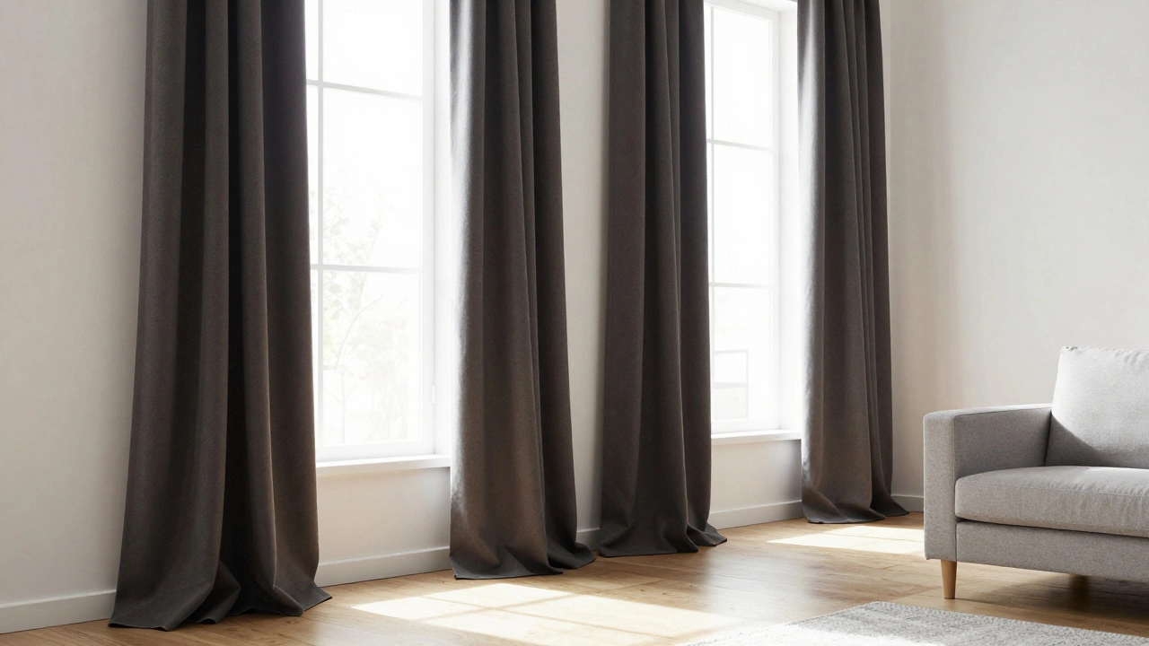
Darker curtains shine in rooms with lots of natural light. If your windows face south or west and flood the space with sunlight all afternoon, dark curtains help balance the brightness. They prevent the room from feeling washed out. In a sun-drenched white living room, navy or forest green curtains add richness without making the space feel smaller.Dark curtains also work well in bedrooms where you want to block light. Blackout curtains in deep burgundy or charcoal aren’t just functional - they add a sense of luxury. Studies from the Journal of Environmental Psychology show that people in rooms with darker window treatments report feeling more relaxed and sleep better, especially when the room is used for rest.
Also consider the ceiling height. In rooms with low ceilings, dark curtains that start near the ceiling and pool on the floor create vertical lines. That illusion makes the room feel taller. A 2023 survey of 1,200 homeowners found that 68% of those who installed floor-to-ceiling dark curtains felt their ceilings appeared higher, even without changing the actual height.
When Lighter Curtains Are the Better Choice
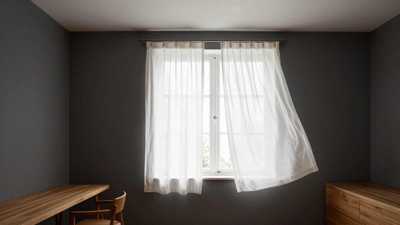
If your room is already dark - think small windows, north-facing light, or dark walls - going darker with curtains can make it feel like a cave. Lighter curtains in these cases open up the space. Cream, soft gray, or pale linen let in what little light there is and reflect it back into the room.Small rooms benefit from this too. A 10x12 bedroom with dark walls and dark curtains can feel claustrophobic. Switch to a cream or oat-colored curtain, and suddenly the window feels bigger, the air feels lighter. You don’t need to match the walls - just go one or two shades lighter. A pale gray curtain on a charcoal wall? That’s a classic, calming combo.
What About Matching? Should Curtains Match the Walls?
Matching curtains to walls is a common mistake. It makes the window disappear. If your walls are a warm beige and your curtains are the same beige, your window loses definition. The room feels flat. You want contrast, not repetition.Instead, think in tones. If your walls are a warm taupe, try a curtain in a cool gray or deep olive. That contrast adds dimension. The goal isn’t harmony through sameness - it’s harmony through balance. A rule of thumb: choose a curtain color that’s in the same color family but at least one step darker or lighter.
How to Test Curtain Colors Before You Buy
Don’t just grab the first sample you see. Bring home at least three fabric swatches. Tape them to the wall near the window. Observe them at different times of day - morning, noon, and evening. Light changes everything.Here’s what to look for:
- Does the curtain look too heavy when the sun hits it?
- Does it disappear against the wall at dusk?
- Does it pull the eye upward or make the ceiling feel lower?
Also, hold the swatch up to the furniture. If your sofa is a deep brown, a black curtain might feel too intense. A charcoal or chocolate brown might blend better. You’re not matching - you’re connecting.
Color Psychology and Curtain Choices
Color affects mood. Dark blues and greens promote calm - great for bedrooms. Dark reds or burgundies add warmth and drama - perfect for dining rooms or libraries. But dark browns or grays can feel heavy if used without contrast.Lighter curtains - whites, creams, pale yellows - boost energy and make spaces feel more open. That’s why they’re popular in kitchens and home offices. But if you use them in a room with dark furniture or floors, you risk making the space feel disjointed. That’s why contrast matters more than lightness.
Real-World Examples That Work
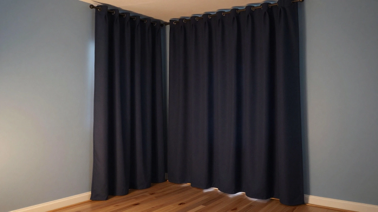
In a modern loft with white walls and black metal beams, deep charcoal curtains create a dramatic frame around the windows. The contrast is intentional, not accidental.In a traditional bedroom with pale blue walls and wooden floors, navy curtains add depth without clashing. The wood ties the two colors together.
On the flip side, a small studio apartment with dark gray walls and black curtains felt like a closet. Switching to a soft white linen curtain made the room feel 30% larger - not because of square footage, but because of how light moved through the space.
The Rule of Thumb
There’s no magic formula, but here’s a simple guideline:- If your room has bright light and light walls → try darker curtains.
- If your room is dim or has dark walls → go lighter.
- If you’re unsure → pick a curtain color that’s one shade darker than your wall, but not darker than your furniture.
And always let the function guide you. Want privacy and sleep? Darker is better. Want to brighten a gloomy corner? Go light.
Final Thought: It’s About Balance, Not Rules
There’s no rule that says curtains must be darker. Or lighter. The best choice is the one that makes the room feel complete. A room with dark walls, dark floors, and dark curtains? That’s a cave. A room with white walls, white ceiling, and white curtains? That’s a void. The sweet spot is in between - where color has weight, light has room to breathe, and the window becomes a feature, not an afterthought.Should curtains be darker than the walls?
It depends. Darker curtains can add depth to light rooms and create a cozy, grounded feel. But in dark rooms, they can make the space feel smaller. The key is contrast - choose a curtain color that’s one shade darker or lighter than the wall, not the same. Always test swatches in natural and artificial light before buying.
Do dark curtains make a room look smaller?
Only if the rest of the room is already dark. Dark curtains on dark walls and dark furniture can shrink a space visually. But if the room has light walls, bright floors, or lots of natural light, dark curtains add richness without making the room feel cramped. In fact, they can make the ceiling appear higher by drawing the eye upward.
Can I use black curtains in a living room?
Yes - if your living room has light walls, plenty of natural light, and lighter furniture. Black curtains work as a bold frame, especially with modern or industrial design. Avoid black in small, dim rooms or with dark wood floors. In those cases, charcoal or deep brown is a better choice.
What’s the best curtain color for a bedroom?
For sleep, go for deep blues, greens, or grays. These colors reduce light reflection and promote calm. If your walls are light, dark curtains help block outside light. If your walls are already dark, choose a medium tone - like charcoal or navy - to avoid a cave-like feel. Always pair with blackout lining for best results.
Do curtains have to match the sofa?
No. Curtains don’t need to match the sofa - they should complement it. A good trick is to pick a curtain color that’s in the same color family as the sofa but lighter or darker. For example, if your sofa is mustard yellow, try a soft cream or olive green curtain. This creates cohesion without being matchy-matchy.
How do I choose curtain color if my walls are patterned?
Look for the dominant color in the pattern - the one that appears most often. Choose a curtain color that matches or is one shade darker than that color. Avoid picking a color from a small accent in the pattern. If your wallpaper has navy, gold, and cream, go with navy or a slightly lighter gray. This keeps the window from competing with the wall.
When in doubt, remember: curtains are the frame, not the painting. Their job isn’t to blend in - it’s to elevate what’s already there.